This comprehensive guide will provide you with detailed guidance on how to write highly effective AI prompts that will enable you to generate a wide variety of charts with utmost accuracy using the advanced Onvo AI platform. It is crucial to understand that by crafting clear, concise, and unambiguous prompts, you can significantly enhance the platform's AI capabilities, ensuring comprehension of your data and the subsequent production of insightful and visually appealing visualizations.
Whether you're a seasoned pro or just starting out with Onvo AI, this guide is your way to making the most of the platform's superpowers. And if this is your first time using Onvo AI, no worries! You can head over to www.onvo.ai to dive into how AI can be your sidekick, making data visualization a breeze.
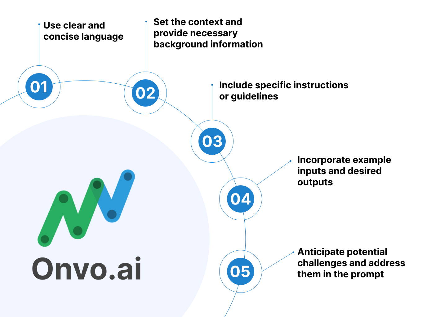
To optimize your AI prompts and maximize the potential of the Onvo AI platform, checkout some of our tips from the team at Onvo outlined below.
Tip 1: Define the Chart Type
Before writing an AI prompt, it is important to carefully consider and determine the specific type of chart you want to generate. There are several different types of charts that you can choose from, such as bar charts, line charts, pie charts, and scatter plots. Each type of chart has its own unique characteristics and purposes, and selecting the most appropriate chart type upfront will greatly enhance the effectiveness of your prompt. By identifying the chart type in advance, you will be able to provide more tailored and accurate instructions to the AI, resulting in a more precise and satisfactory chart generation. Therefore, taking the time to decide on the specific chart type before proceeding with your prompt is highly recommended.
Here are some example AI prompts for generating various types of charts:
- Bar Chart:
Prompt: "Generate a bar chart comparing the sales performance of three different products (Product A, Product B, and Product C) over the last five months." - Line Chart:
Prompt: "Create a line chart to visualize the temperature trends in New York City over the past year, with monthly data points." - Pie Chart:
Prompt: "Produce a pie chart illustrating the distribution of monthly household expenses, including categories such as rent, groceries, utilities, and entertainment, for the month of August." - Scatter Plot:
Prompt: "Generate a scatter plot to show the relationship between the hours of study and the exam scores for a group of 50 students." - Histogram:
Prompt: "Create a histogram to display the distribution of ages in a survey of 200 participants." - Stacked Bar Chart:
Prompt: "Generate a stacked bar chart representing the composition of monthly website traffic sources (organic, referral, social, and direct) for a specific e-commerce website." - Area Chart:
Prompt: "Produce an area chart to illustrate the growth of a company's revenue over the past five years." - Radar Chart:
Prompt: "Create a radar chart to compare the performance of three different job applicants across various skills like communication, technical knowledge, teamwork, and problem-solving." - Funnel Chart:
Prompt: "Create a funnel chart showing three stages - number of leads, number of customers and number of orders." - Table:
Prompt: "Create a table showing the different states. On each row, show the name of the state and the number of orders from the state"
Tip 2: Specify Data Fields
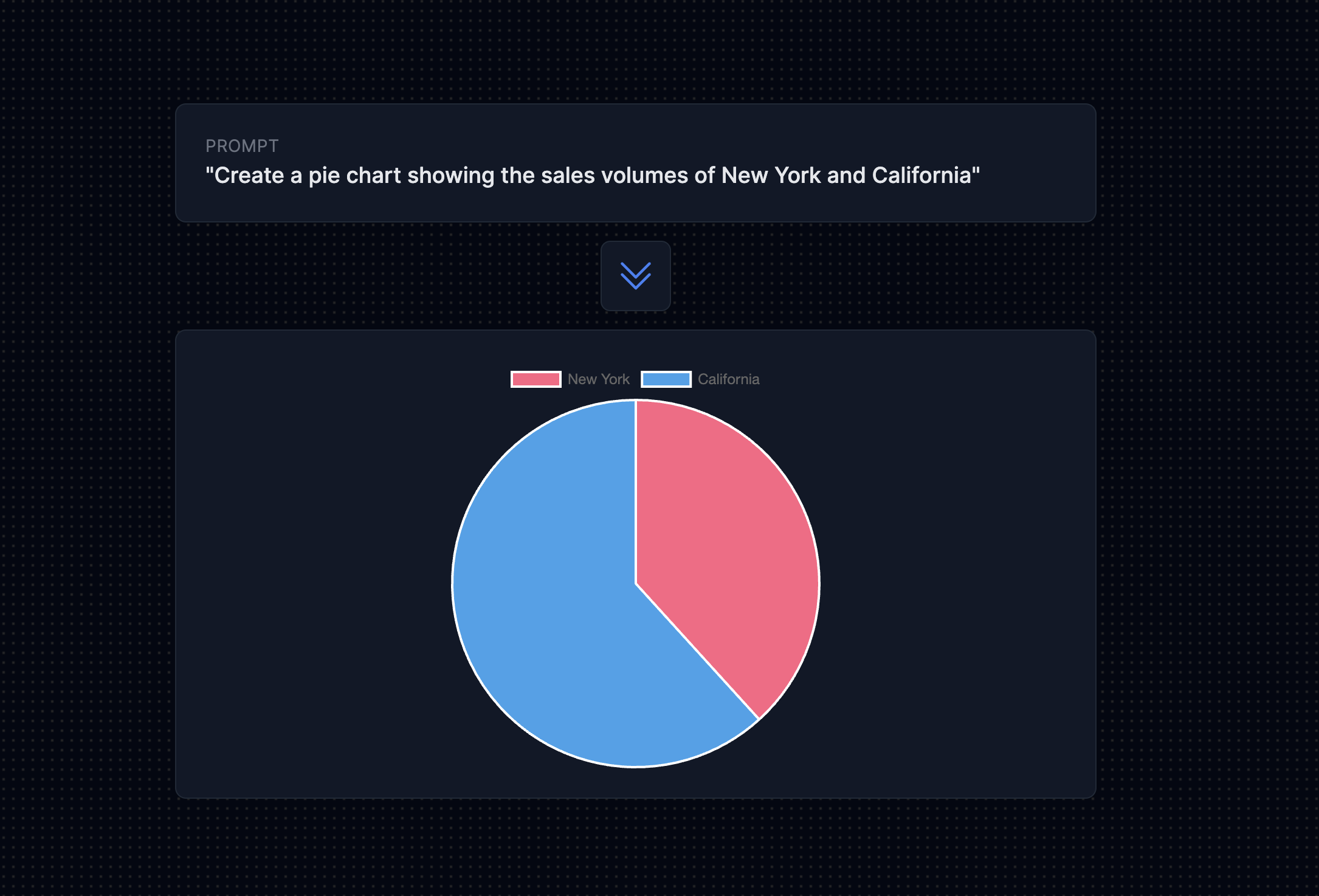
To ensure clarity and comprehensiveness, it is important to clearly specify the specific data fields that you would like to include in the chart. For instance, if you desire to create a bar chart that compares the sales figures across different regions, it is essential to mention the specific fields such as "Region" and "Sales" in your prompt. By providing this level of detail, it will facilitate a more accurate and precise representation of the data in the chart, enabling a better understanding of the sales performance across various regions.
Here are some example AI prompts that include specific data fields to ensure clarity and comprehensiveness:
- Bar Chart Comparing Sales Across Regions:
Prompt: "Generate a bar chart comparing the sales figures across different regions (North, South, East, West) for the last quarter. Use the 'Region' field for the x-axis and the 'Sales' field for the y-axis." - Line Chart Showing Monthly Revenue Trends:
Prompt: "Create a line chart to visualize the monthly revenue trends for the past year. Use the 'Month' field for the x-axis and the 'Revenue' field for the y-axis." - Pie Chart of Monthly Household Expenses:
Prompt: "Produce a pie chart illustrating the distribution of monthly household expenses for August. Include categories such as 'Rent,' 'Groceries,' 'Utilities,' and 'Entertainment' with their respective expense amounts." - Scatter Plot for Study Hours vs. Exam Scores:
Prompt: "Generate a scatter plot to show the relationship between 'Study Hours' and 'Exam Scores' for a group of 50 students. Plot 'Study Hours' on the x-axis and 'Exam Scores' on the y-axis." - Histogram of Age Distribution:
Prompt: "Create a histogram to display the distribution of ages in a survey of 200 participants. Use the 'Age' field for the x-axis and the frequency of each age group for the y-axis." - Stacked Bar Chart of Website Traffic Sources:
Prompt: "Produce a stacked bar chart representing the composition of monthly website traffic sources (organic, referral, social, and direct). Utilize the 'Month' field for the x-axis and the respective traffic source data for the y-axis." - Area Chart for Revenue Growth:
Prompt: "Generate an area chart to illustrate the growth of the company's 'Revenue' over the past five years. Use 'Year' for the x-axis and 'Revenue' for the y-axis." - Radar Chart for Job Applicant Skills:
Prompt: "Create a radar chart to compare the performance of three job applicants across various skills (communication, technical knowledge, teamwork, problem-solving). Each skill should be a separate axis on the chart."
These prompts specify the relevant data fields for each chart type, making it clear to the AI what information to include in the visualizations. This level of detail helps ensure that the generated charts accurately represent the data and the intended insights.
Tip 3: Provide Aggregation Instructions
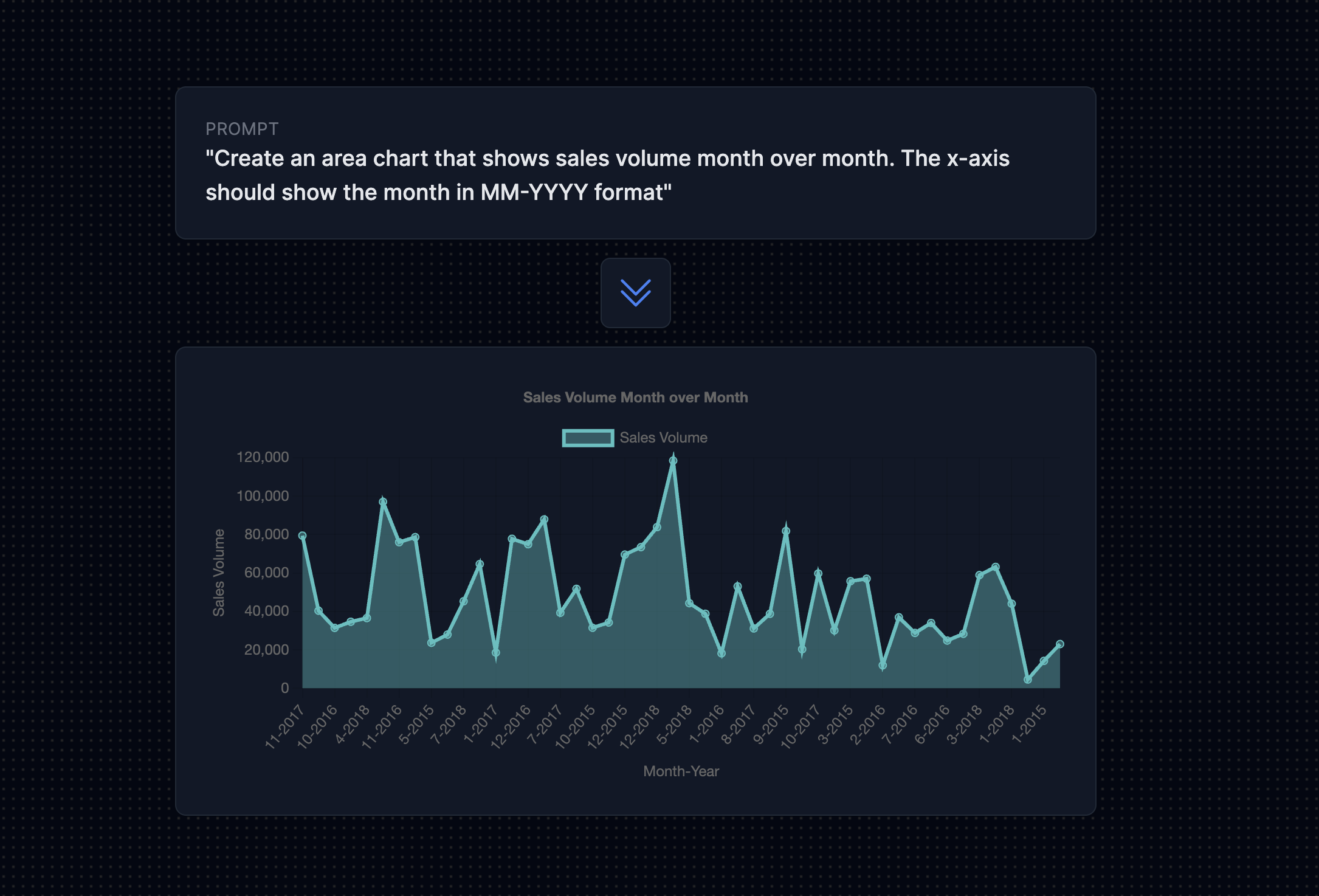
If you need the AI to aggregate or summarize data, please provide detailed instructions regarding the desired aggregation method. For example, you can specify that you want the AI to generate a bar chart illustrating the total sales per month. In order to accomplish this, kindly indicate that you require the AI to calculate the sum of the sales figures for each month. By clearly conveying your requirements, the AI will be able to accurately fulfill your request and produce the desired outcome.
Here are some example AI prompts that include detailed instructions for aggregating or summarizing data:
- Bar Chart of Total Monthly Sales:
Prompt: "Generate a bar chart illustrating the total sales per month for the past year. Calculate the sum of 'Sales' figures for each month and plot it on the y-axis, with 'Month' on the x-axis." - Line Chart of Monthly Average Temperatures:
Prompt: "Create a line chart to visualize the monthly average temperatures in New York City for the past year. Calculate the average temperature for each month and use it as the data points on the y-axis, with 'Month' on the x-axis." - Pie Chart of Total Monthly Expenses:
Prompt: "Produce a pie chart depicting the total monthly household expenses for August. Calculate the sum of expenses in categories such as 'Rent,' 'Groceries,' 'Utilities,' and 'Entertainment' to create the chart." - Scatter Plot Showing Average Exam Scores:
Prompt: "Generate a scatter plot to display the relationship between 'Average Study Hours' and 'Average Exam Scores' for a group of 50 students. Calculate the average scores for each student and use these values for the scatter plot." - Histogram of Age Distribution with Binned Data:
Prompt: "Create a histogram to show the distribution of ages in a survey of 200 participants. Group the ages into bins (e.g., 0-10, 11-20, etc.), calculate the frequency for each bin, and plot it on the y-axis, with the age bins on the x-axis." - Stacked Bar Chart of Monthly Website Traffic Share:
Prompt: "Produce a stacked bar chart representing the share of different traffic sources (organic, referral, social, and direct) for each month. Calculate the percentage share of each source and plot it for each month." - Area Chart for Cumulative Revenue Growth:
Prompt: "Generate an area chart to illustrate the cumulative growth of the company's 'Revenue' over the past five years. Calculate the cumulative sum of revenue for each year and use it as the data points for the chart." - Radar Chart for Normalized Applicant Skills:
Prompt: "Create a radar chart to compare the performance of three job applicants across various skills (communication, technical knowledge, teamwork, problem-solving). Normalize the scores for each skill to a common scale (e.g., 0-100) before plotting."
These prompts provide clear instructions on data aggregation methods to ensure the AI produces the desired outcome with accurate summaries and visualizations.
Tip 4: Add Filtering Criteria
If you want to filter the data based on specific conditions, include the filtering criteria in your prompt. This will allow you to narrow down the data to only what you need. For example, if you only want to include sales data for a particular product category, mention the category name in your prompt. By specifying the category, you can ensure that the data you receive is relevant and accurate. This is especially useful when dealing with large datasets, as it helps you focus on the specific information you require. So remember, when requesting data, be clear about the filtering criteria you want to apply, such as the product category, to get the most relevant and useful results.
Here are some example AI prompts that include filtering criteria to ensure that the generated data or charts are specific to certain conditions:
- Filtered Bar Chart for Product Sales:
Prompt: "Generate a bar chart comparing the sales figures for the 'Electronics' product category over the last quarter. Use the 'Month' field for the x-axis and the 'Sales' field for the y-axis." - Filtered Line Chart for Monthly Temperature Trends:
Prompt: "Create a line chart to visualize the monthly temperature trends in New York City for the past year, only including data for the summer months (June, July, August). Use 'Month' on the x-axis and 'Temperature' on the y-axis." - Filtered Pie Chart for Monthly Grocery Expenses:
Prompt: "Produce a pie chart illustrating the distribution of monthly 'Groceries' expenses for August, filtering out other expense categories. Include 'Groceries' expense amounts only in the chart." - Filtered Scatter Plot for Study Hours vs. Exam Scores:
Prompt: "Generate a scatter plot to show the relationship between 'Study Hours' and 'Exam Scores' for a group of 50 students who are majoring in 'Mathematics.' Plot 'Study Hours' on the x-axis and 'Exam Scores' on the y-axis." - Filtered Histogram for Age Distribution:
Prompt: "Create a histogram to display the distribution of ages in a survey of 200 participants, filtering for 'Male' participants only. Use 'Age' for the x-axis and frequency for the y-axis." - Filtered Stacked Bar Chart for Website Traffic Sources:
Prompt: "Produce a stacked bar chart representing the composition of monthly website traffic sources (organic, referral, social, and direct) for the last quarter, filtering out 'Direct' traffic source data. Utilize the 'Month' field for the x-axis." - Filtered Area Chart for Revenue Growth:
Prompt: "Generate an area chart to illustrate the growth of the company's 'Revenue' over the past five years, only including data for the 'Tech' division. Use 'Year' for the x-axis and 'Revenue' for the y-axis." - Filtered Radar Chart for Applicant Skills:
Prompt: "Create a radar chart to compare the performance of three job applicants, filtering for 'Engineering' applicants only. Include skills like communication, technical knowledge, teamwork, and problem-solving as separate axes." - Filtered Box Plot for Salary Distribution by Experience Level:
Prompt: "Produce a box plot to visualize the distribution of 'Salaries' for employees in the finance department, filtering for employees with '5-10 years of experience.' Separate the data by 'Experience Level' and create a box plot for each level."
These prompts include specific filtering criteria to ensure that the generated data or charts are tailored to the conditions or categories you want to focus on, resulting in more relevant and useful results.
Tip 5: Specify Sorting Order
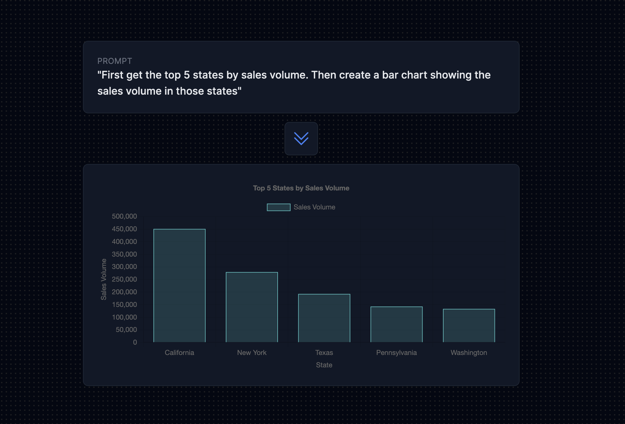
If you want the chart to display the data in a specific order, it is important to provide clear instructions for sorting. By specifying the desired order, you can ensure that the chart accurately reflects the intended presentation of the data. For example, if you want a bar chart to show the sales figures in a descending order, it is crucial to mention this requirement in your prompt. This way, the chart will effectively showcase the sales performance from highest to lowest, allowing viewers to easily identify trends and patterns. Remember, providing detailed instructions for sorting will enhance the overall clarity and effectiveness of the chart.
Here are some example AI prompts that include clear instructions for sorting data in a specific order to enhance the clarity and effectiveness of the chart:
- Descending Order Bar Chart for Product Sales:
Prompt: "Generate a bar chart comparing the sales figures for the 'Electronics' product category over the last quarter, sorted in descending order by sales. Use the 'Month' field for the x-axis and the 'Sales' field for the y-axis." - Ascending Order Line Chart for Monthly Temperature Trends:
Prompt: "Create a line chart to visualize the monthly temperature trends in New York City for the past year, sorted in ascending order by temperature. Use 'Month' on the x-axis and 'Temperature' on the y-axis." - Descending Order Pie Chart for Monthly Grocery Expenses:
Prompt: "Produce a pie chart illustrating the distribution of monthly 'Groceries' expenses for August, sorted in descending order by expense amounts. Include the top expense categories in the chart." - Ascending Order Scatter Plot for Study Hours vs. Exam Scores:
Prompt: "Generate a scatter plot to show the relationship between 'Study Hours' and 'Exam Scores' for a group of 50 students, sorted in ascending order by study hours. Plot 'Study Hours' on the x-axis and 'Exam Scores' on the y-axis." - Descending Order Histogram for Age Distribution:
Prompt: "Create a histogram to display the distribution of ages in a survey of 200 participants, sorted in descending order by age frequency. Use 'Age' for the x-axis and frequency for the y-axis." - Descending Order Stacked Bar Chart for Website Traffic Sources:
Prompt: "Produce a stacked bar chart representing the composition of monthly website traffic sources (organic, referral, social, and direct) for the last quarter, sorted in descending order by the total traffic volume. Utilize the 'Month' field for the x-axis." - Ascending Order Area Chart for Revenue Growth:
Prompt: "Generate an area chart to illustrate the growth of the company's 'Revenue' over the past five years, sorted in ascending order by revenue. Use 'Year' for the x-axis and 'Revenue' for the y-axis." - Descending Order Radar Chart for Applicant Skills:
Prompt: "Create a radar chart to compare the performance of three job applicants, sorted in descending order by overall performance. Include skills like communication, technical knowledge, teamwork, and problem-solving as separate axes."
These prompts provide clear instructions for sorting data in specific orders, ensuring that the generated charts effectively reflect the intended presentation of the data, making it easier for viewers to identify trends and patterns.
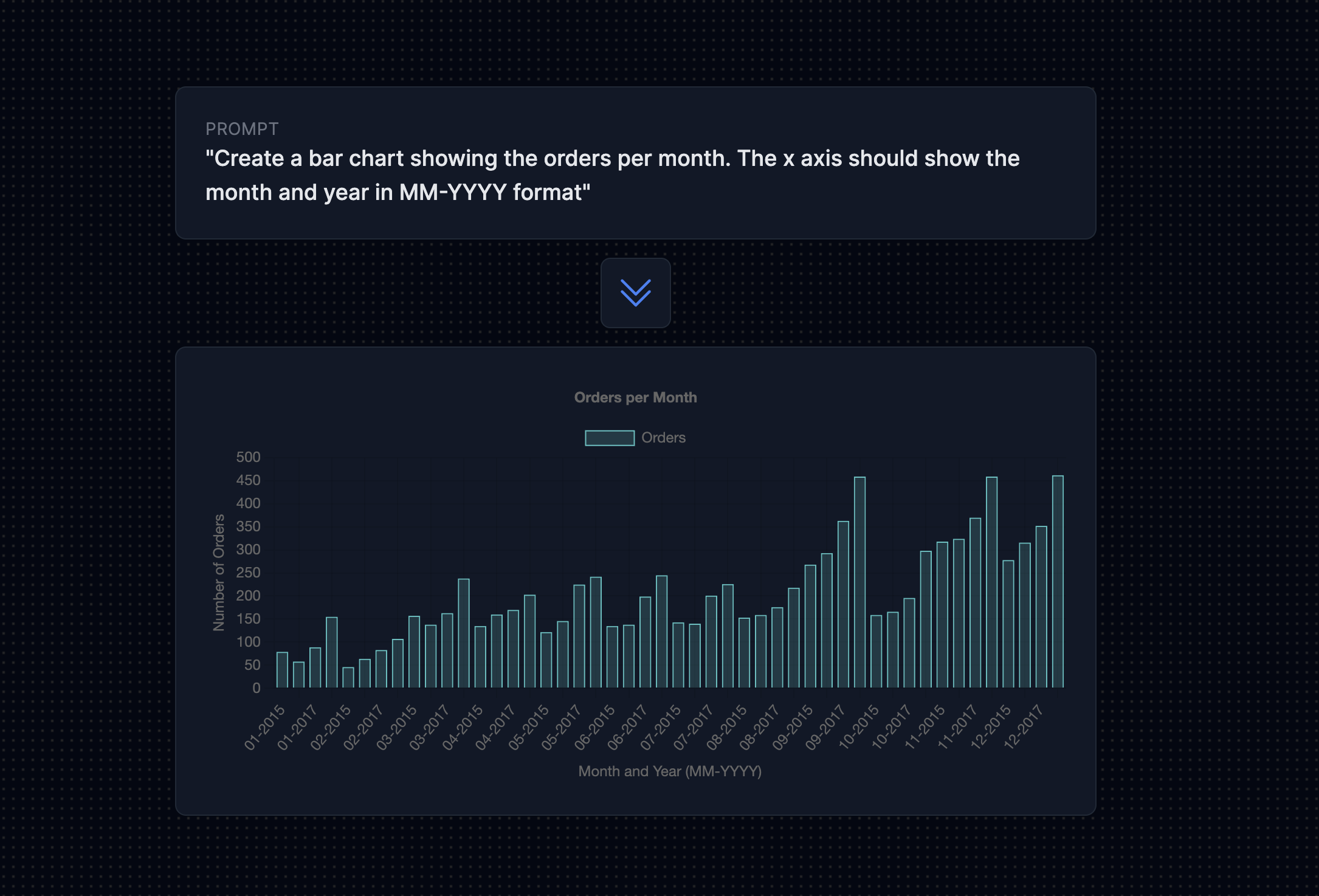
Tip 6: Include Formatting Preferences
If you have any specific formatting preferences for the chart, such as color schemes or axis labels, please mention them in your prompt. Providing detailed instructions about your desired visual style will assist the AI in generating a chart that perfectly aligns with your preferences and enhances the overall visual appeal. Additionally, feel free to provide any specific requirements or guidelines to ensure that the chart accurately represents and conveys the data you intend to present.
Here are some example AI prompts that include specific formatting preferences for charts to ensure they align with your desired visual style:
- Bar Chart with Custom Color Scheme for Product Sales:
Prompt: "Generate a bar chart comparing the sales figures for the 'Electronics' product category over the last quarter. Please use a color scheme with shades of blue, and label the x-axis as 'Months' and the y-axis as 'Sales (in USD).'" - Line Chart with Axis Labels for Monthly Temperature Trends:
Prompt: "Create a line chart to visualize the monthly temperature trends in New York City for the past year. Please include clear axis labels with 'Month' on the x-axis and 'Temperature (°F)' on the y-axis." - Pie Chart with Custom Colors for Monthly Grocery Expenses:
Prompt: "Produce a pie chart illustrating the distribution of monthly 'Groceries' expenses for August. Use a color palette with various shades of green and ensure that expense categories are labeled within the chart." - Scatter Plot with Custom Marker Styles:
Prompt: "Generate a scatter plot to show the relationship between 'Study Hours' and 'Exam Scores' for a group of 50 students. Please use custom marker styles for data points, such as circles for 'Study Hours' and triangles for 'Exam Scores." - Histogram with Data Labels for Age Distribution:
Prompt: "Create a histogram to display the distribution of ages in a survey of 200 participants. Include data labels on top of each bar to indicate the frequency, and label the x-axis as 'Age'." - Stacked Bar Chart with Gradient Colors for Website Traffic Sources:
Prompt: "Produce a stacked bar chart representing the composition of monthly website traffic sources (organic, referral, social, and direct) for the last quarter. Use a gradient color scheme and label the x-axis as 'Month'." - Area Chart with Smoothed Lines for Revenue Growth:
Prompt: "Generate an area chart to illustrate the growth of the company's 'Revenue' over the past five years. Please use smoothed lines to connect data points and label the x-axis as 'Year' and the y-axis as 'Revenue (in millions).'" - Radar Chart with Custom Axis Labels for Applicant Skills:
Prompt: "Create a radar chart to compare the performance of three job applicants across various skills (communication, technical knowledge, teamwork, problem-solving). Customize axis labels to reflect the skill names and label the chart 'Skills Comparison.'"
These prompts include specific formatting preferences to ensure the charts align with your desired visual style, making them visually appealing and effective in conveying the data.
Tip 7: Review and Refine
After you have finished writing your AI prompt, it is essential to take a few moments to carefully review it for clarity and completeness. This review process allows you to ensure that all the necessary information has been adequately included in the prompt and that it accurately reflects your intentions. If you find any areas where additional details or clarification is needed, take the opportunity to revise and refine the prompt accordingly. By doing so, you can effectively convey your requirements and ensure that they are understood by others.
Conclusion
Writing clear and well-defined prompts is essential when using AI platforms like Onvo AI to generate charts. These prompts ensure that the AI accurately interprets your data, enabling the creation of charts that effectively convey your intended insights. Specific instructions, such as data fields, filtering criteria, sorting preferences, and formatting choices, help narrow the focus and style of the charts, making them more relevant, visually appealing, and engaging for your audience. Well-crafted prompts not only save time but also empower you to make data-driven decisions based on accurate and aesthetically pleasing visualizations, enhancing your communication with AI and elevating the impact of your data presentations.
In a world driven by data, the ability to generate charts that tell a clear and compelling story is invaluable. Clear and well-defined prompts unlock the potential of AI, enabling you to harness the power of data visualization to inform, engage, and inspire action.
Happy chart generation!
