In the realm of data management, SQL dashboards stand out as powerful tools that unveil the potential of visualizing data stored in databases such as MySQL, PostgreSQL, or Snowflake. In this exploration, we delve into the intricacies of SQL dashboards, shedding light on their functionality, types, and the transformative impact they bring to both data analysis and communication.
Understanding SQL Dashboards: A Glimpse into Functionality
At its core, a SQL dashboard empowers users to transform raw data into compelling visualizations, requiring the use of SQL (Structured Query Language) to pinpoint and select specific data from a database. These dashboards serve as dynamic tools that cater to a broader audience, including individuals who lack the time, technical skills, or opportunity to directly access the underlying database.
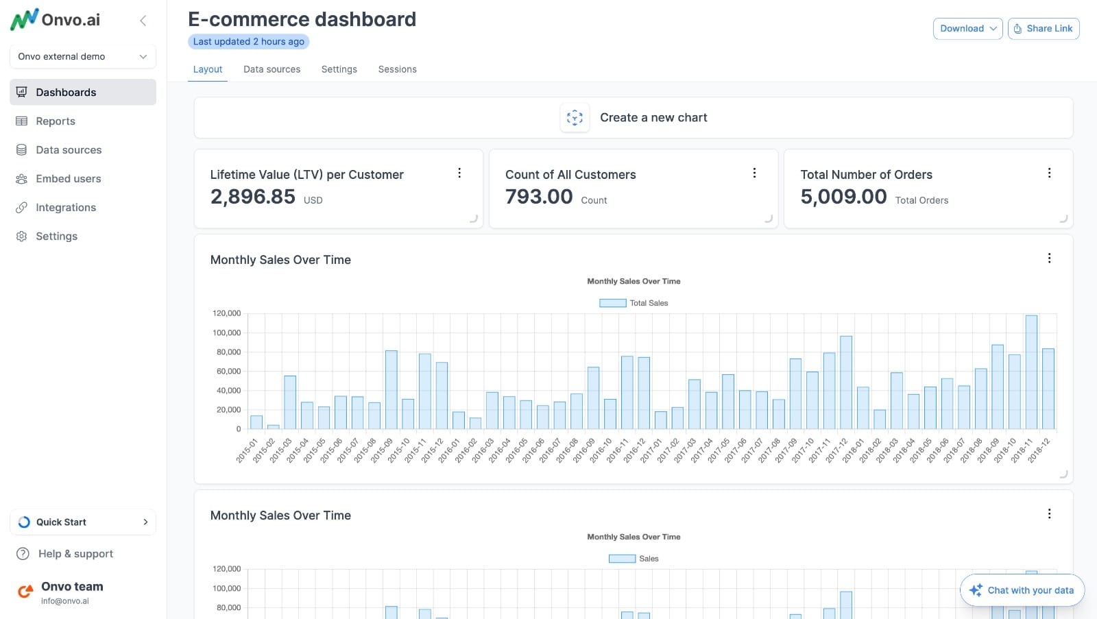
Example of a SQL Dashboard: Witnessing the Power with Onvo
To grasp the essence of a SQL dashboard, let's take a look at an example crafted using Onvo, a platform known for its prowess in data visualization.
Diverse Types of SQL Dashboards: Meeting Varied Business Needs
SQL dashboards come in various types, each designed to address specific business requirements. Broadly categorized into two groups, these dashboards cater to distinct needs:
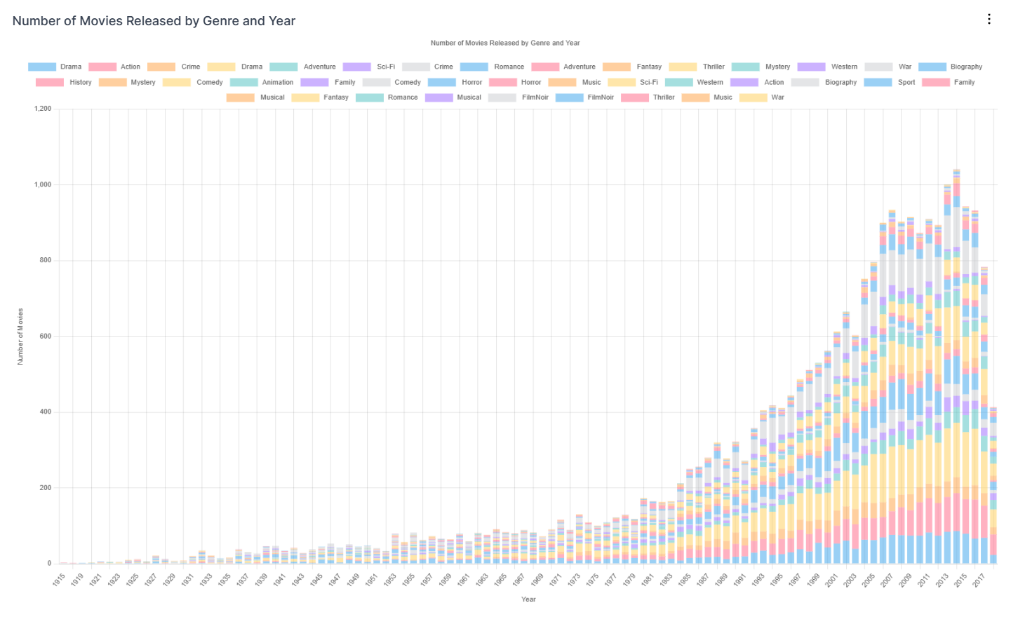
Analysis Dashboards:
Tailored for individuals involved in in-depth data investigation and analysis, these dashboards are synonymous with Business Intelligence (BI) tools like PowerBI or Tableau. Users can leverage SQL to access specific datasets within a database, with the dashboard aiding in the analysis through visualizations that uncover trends and relationships.
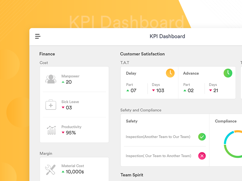
Communication Dashboards (KPI Dashboards):
Focused on conveying live data and Key Performance Indicators (KPIs) to a broader audience, these dashboards prioritize visual consumption. Onvo, as an example, excels in seamlessly integrating with SQL databases to create visually impactful displays that highlight changes in data, making them suitable for sharing online, on TV displays, or through scheduled updates.
Choosing the Right SQL Dashboard: Striking a Balance
The choice between an analysis-focused dashboard and a communication-centric one depends on individual needs. While BI tools like Tableau are ideal for detailed data analysis, KPI dashboard tools such as Onvo AI in delivering information in a visually meaningful and understandable way. Often, a combination of both tools proves to be the most effective strategy.
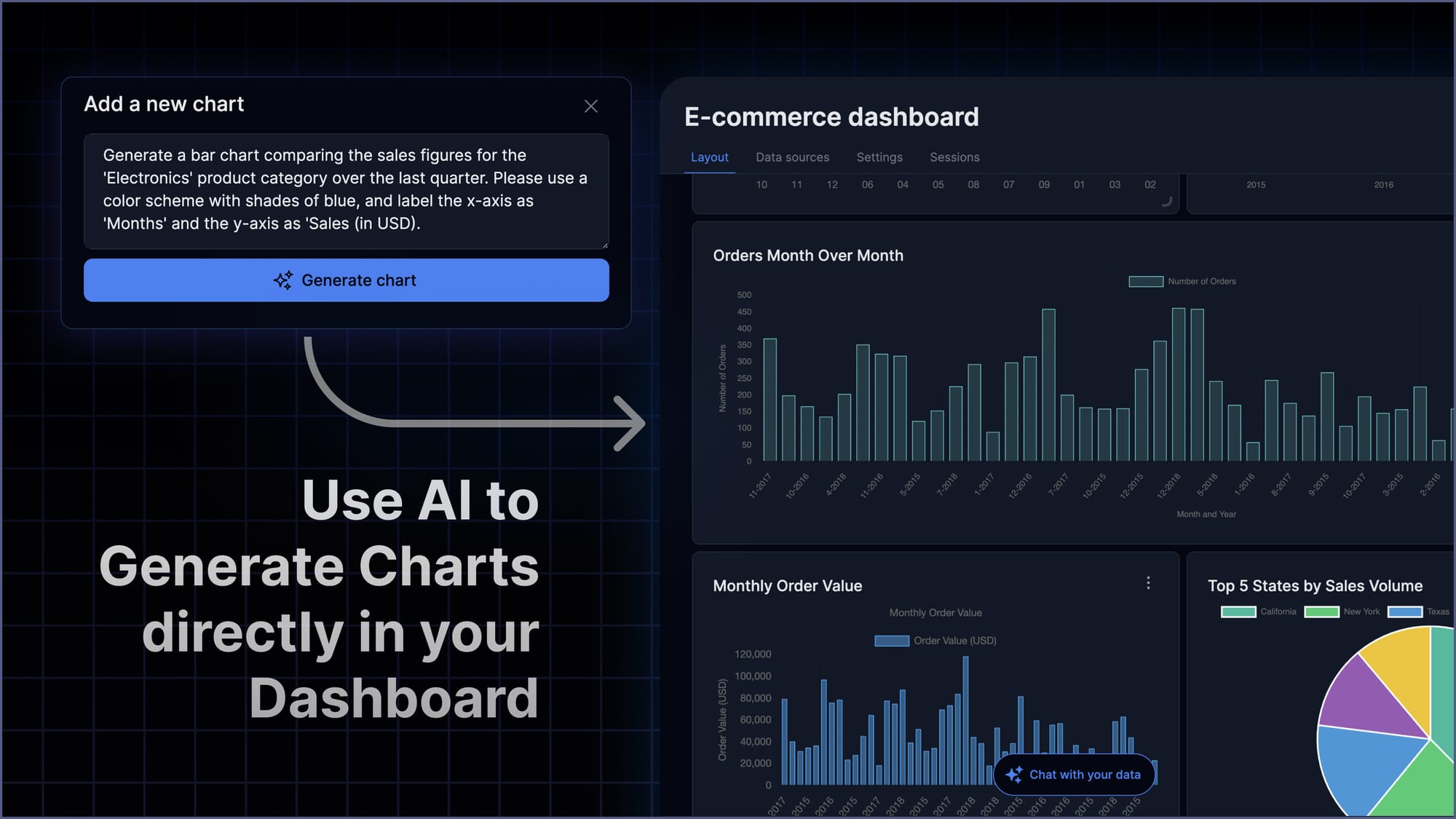
Empowering Users Without SQL Expertise: Breaking Down Barriers
A common question arises: Can individuals use SQL dashboards without a profound understanding of SQL? The answer hinges on the intended use. For those requiring regular data analysis, familiarity with SQL becomes crucial. However, if the goal is to establish a consistent KPI dashboard, the amount of SQL coding needed can be minimal, making it feasible to collaborate with someone versed in SQL to set up the dashboard initially.
Integrating SQL Dashboards with Other Data Sources: A Strategic Approach
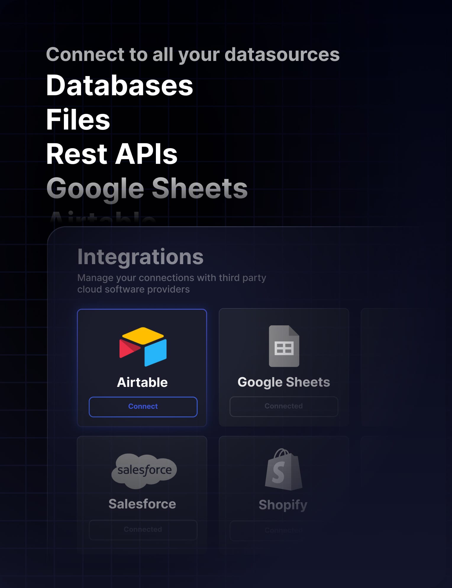
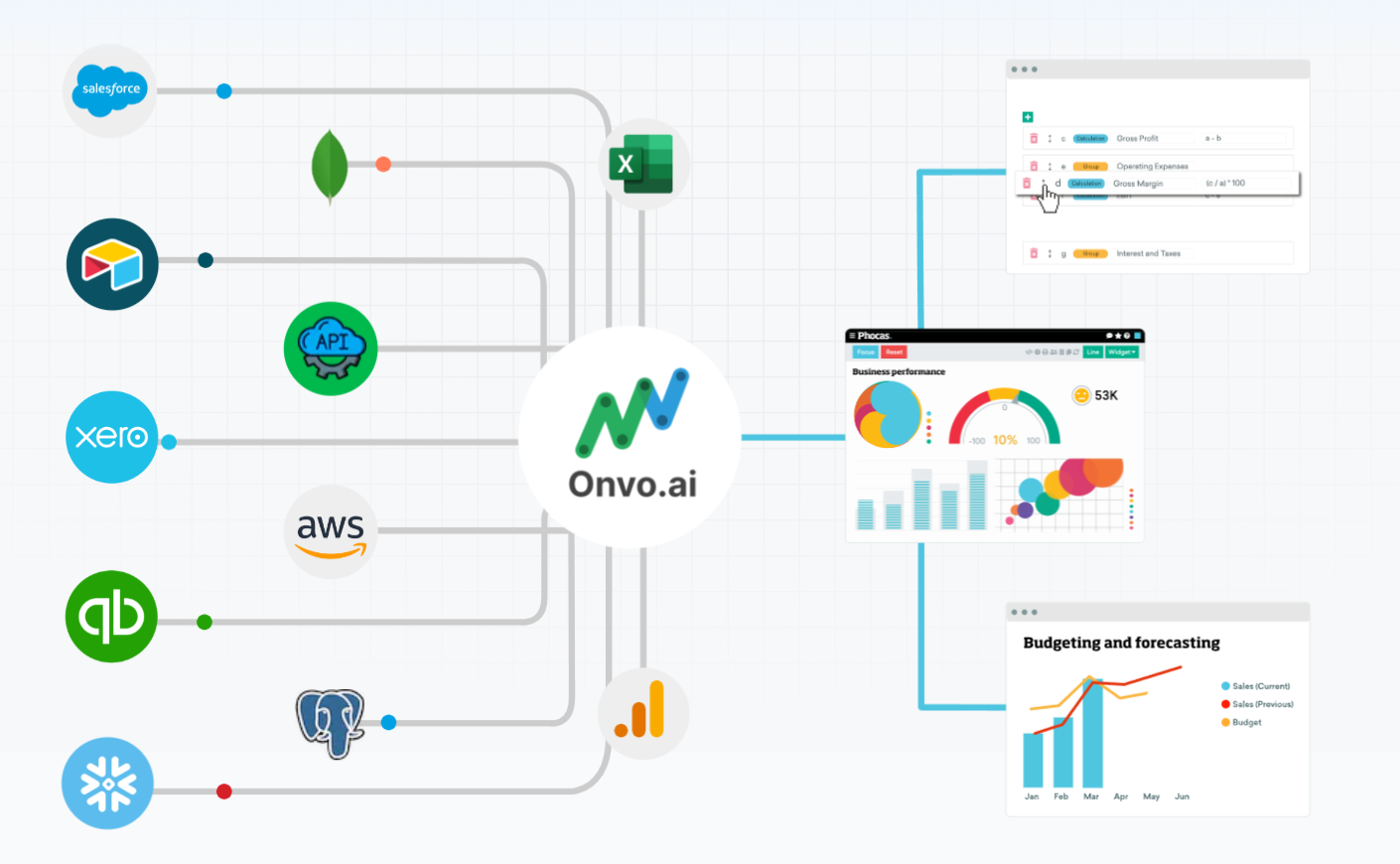
Whether aiming to analyze data from multiple sources or communicate KPIs, the approach to integrating SQL dashboards with other data sources varies. For data analysis, consolidating data into a central location, such as a data lake or warehouse, is recommended. On the other hand, for KPI communication, tools like Onvo offer a streamlined solution, allowing users to create dashboards that seamlessly blend metrics from SQL databases with over 80 different data sources.
Challenges and Considerations: Ensuring Accuracy and Interpretability
While the prospect of AI-generated dashboards is exciting, challenges persist. Ensuring the accuracy and reliability of AI algorithms powering these visualizations remains a key hurdle. As data dynamics evolve, striking the right balance between responsiveness and stability poses an ongoing challenge. Interpretability also comes to the forefront as AI systems become more complex, demanding transparent communication to establish user trust.
Embracing the Transformative Era
In conclusion, the integration of AI into data visualizations through SQL dashboards heralds a transformative era in analytics. The fundamental aspects of Natural Language Generation (NLG) and Natural Language Querying (NLQ) democratize data access, enabling users without technical expertise to interact dynamically with their data. Predictive analysis offers a glimpse into the future, while anomaly detection provides a deeper understanding of data.
However, the excitement of these advancements is tempered by the need for a measured approach. Ensuring the accuracy and interpretability of AI algorithms, addressing potential biases, and maintaining user trust are paramount considerations. As we embrace AI in data visualizations and dashboards, we must navigate this evolving landscape with thoughtful precision.
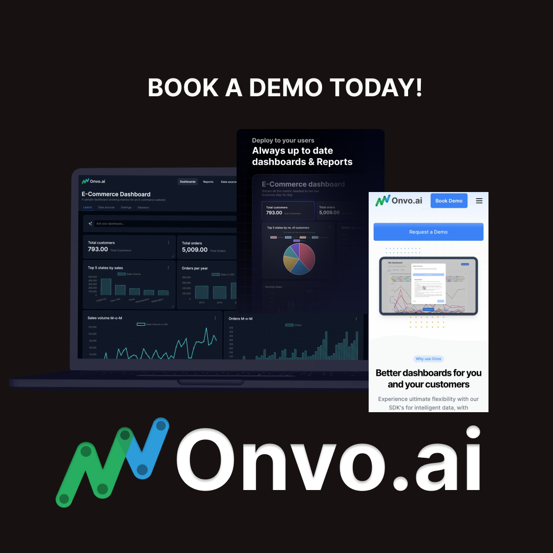
Feel free to request a demo to discover how the Onvo analytics platform navigates this dynamic terrain, equipping users and analytics builders with AI-powered tools. For those seeking to test and experience advanced analytics ideas and features in development, sign up for Onvo AI.
Embark on the journey of unlocking the full potential of your data with SQL dashboards, where every query becomes a visual masterpiece, and every visualization tells a compelling story.
Stay tuned for more insights and updates from the world of data-driven decision-making with Onvo.
