Data is far more than a mere buzzword – it's a strategic asset with the potential to drive success and growth. Whether it's sales figures or customer engagement metrics, data underpins every decision and action. However, there's a crucial element to consider. Without the right tools for visualization, mining actionable insights from data can be an uphill battle.
For instance, imagine the need to identify the most effective marketing channels for driving website traffic and conversions. A standard line chart may display performance trends over time, but it might not effectively spotlight one channel's performance versus another.
This is where data visualization comes into play, making the presentation of data as critical as the data itself. The right visualization tools can unveil trends and opportunities that might otherwise remain hidden.
Empowering Data Understanding with 4 New Visualization Types
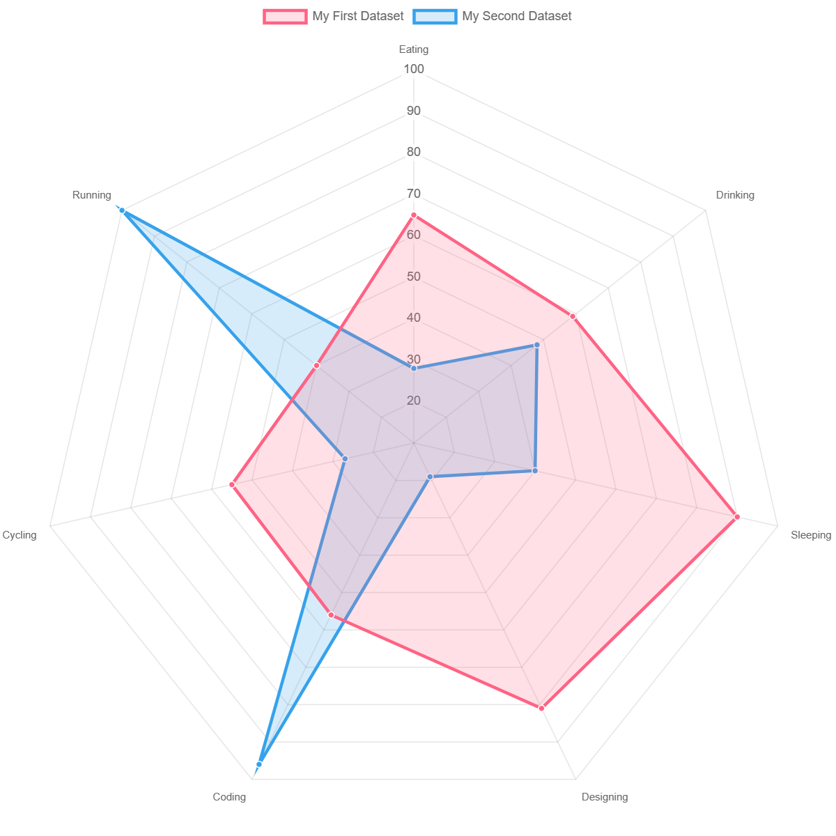
- Radar Chart
A radar chart is a way of showing multiple data points and the variation between them. They are often useful for comparing the points of two or more different data sets. They are your go-to tool for comparing up to 15 metrics and their related dimensions concurrently. By examining polygon shapes, you can rapidly detect patterns and anomalies in your data.
- Scatter Chart
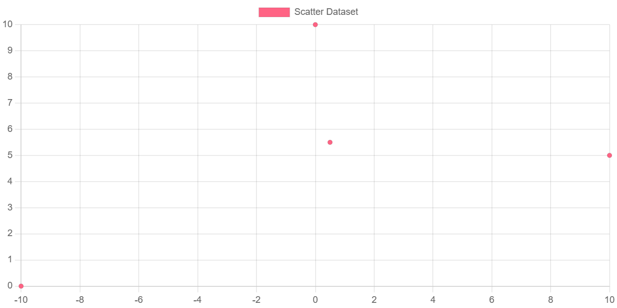
Scatter charts are based on basic line charts with the x-axis changed to a linear axis. To use a scatter chart, data must be passed as objects containing X and Y properties. The example below creates a scatter chart with 4 points.
- Bubble Chart
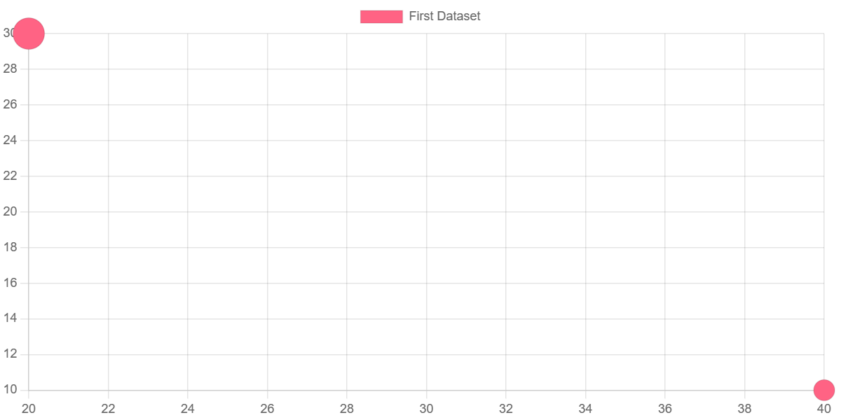
The Bubble Chart facilitates the exploration of data relationships through a format that's easy to grasp. Bubble sizes correspond to metric values, enabling you to quickly identify correlations between your metrics and dimensions. You can include up to 15 metrics, each with 15 dimensions.
- Polar area chart
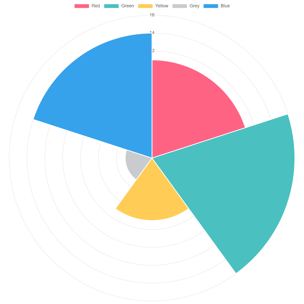
Polar area charts are similar to pie charts, but each segment has the same angle - the radius of the segment differs depending on the value.
This type of chart is often useful when we want to show a comparison data similar to a pie chart, but also show a scale of values for context.
Your Data, Your Way
Presenting data exactly as you need it goes beyond mere convenience – it's about ensuring that you unearth the insights and answers essential to your objectives. With this goal in mind, we're actively developing new capabilities to enhance the intuitiveness of our charts and to improve existing visualizations.
In the near future, you'll have the ability to:
- Combine multiple metrics within a single visualization to gain a deeper understanding of how different metrics correlate.
- Choose from multiple comparison periods to assess current performance against past trends.
- Rearrange the order of Dimensions and Metrics to highlight the most crucial information.
- Adjust the color of individual Metrics to make your insights more accessible to viewers.
Streamlined Dashboard Creation with Onvo
But our efforts don't stop there – we're also simplifying the process of creating and updating dashboards in Onvo.
Onvo will allow you to effortlessly incorporate data from multiple sources into a single dashboard with a single click.
Furthermore, you'll be able to seamlessly switch between various visualization types to find the most effective way to represent your data.
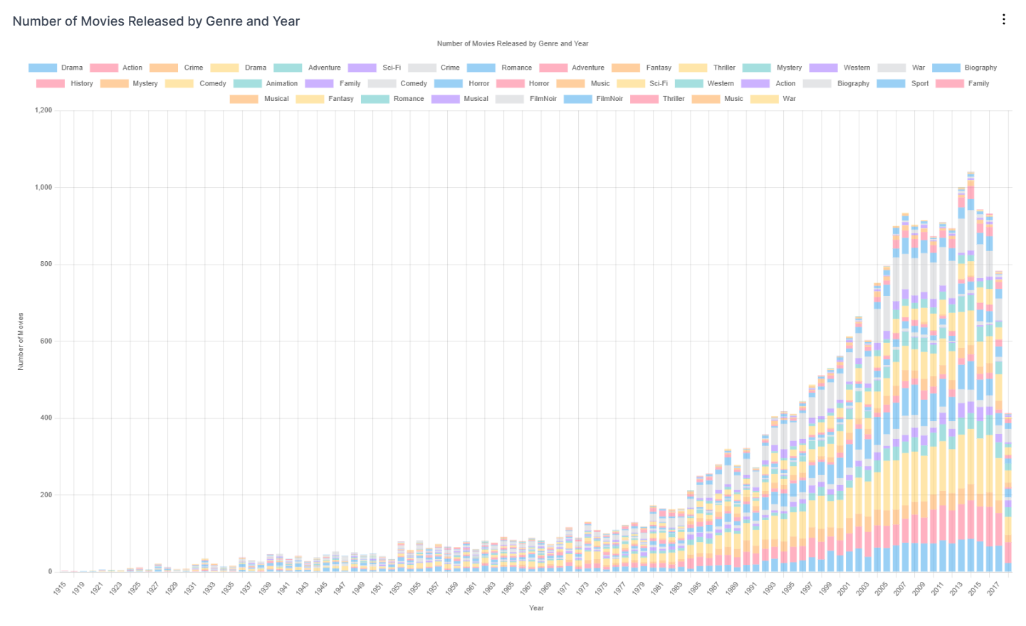
Empower Your Business with More Robust Dashboards
With the addition of new visualization types and increased flexibility, you'll soon have the capacity to design more potent and comprehensive dashboards. These dashboards will offer greater clarity on how your data interconnects, enabling you to discover fresh growth opportunities and make informed decisions for your business.
Exciting updates are right around the corner, so stay tuned for what's in store!
Stay tuned for more insights and updates from the world of data-driven decision-making with Onvo.
